
UI/UX Improvement User Feedback page on app.shakebugs.com
R
Robin Kunz
Improve User-Feedback Dashboard on app.shakebugs.com in terms of UI/UX
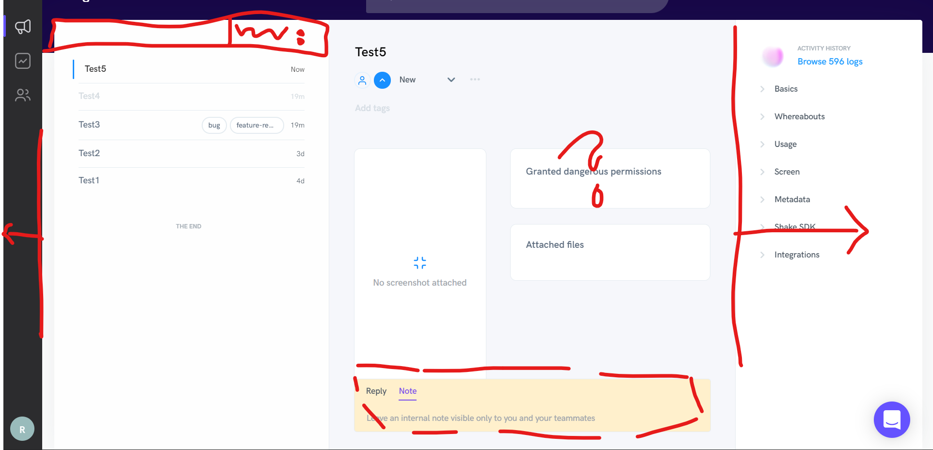
- Filter- and Sorting-functionality for Tickets (first column on the left side); with a lot of tickets it gets tricky. Right now you have to hover to see the importance etc.; you dont see who is asigned etc.
- use space in general better. Quite a lot space is not used very well; make things foldable like the navbar on the left side (the dark one; I just use the User-Feedback tab (the first icon after the Shake logo; I dont know what the other two are: Crash Report (I have Firebase for that) and User (doesnt used it; its blank)). The same with the right panel (Activity history); would do it foldable (from right to the left)
- Whats "Granted dangerous permissions"?
- strange UI (orange, hovering) of the "Reply/Note"-field
- Somehow the middle field just doesn't look clean with the problem described by the user
So I would recommend to work on the UI/UX on this page.
Log In